Structural Distinctions
1.Drawing and Painting
1.1. Opening
The usual distinction between painting and drawing is presence or absence of color. I accept this as a minimal distinction. Yet the artist needs more.
Drawing and painting both create shapes. – Pure drawing outlines. It translates the idea of boundary into black line. – Painting works from inside. It fills in.
In so far as a black and white work is textured and its areas are internally elaborated it is “painterly.” Painterly drawing explores shades of gray…. Rembrandt’s drawings are as atmospheric as Chinese landscapes.
In so far as a painting subordinates texture, color and “the material substance of paint” to linear design it approaches the condition of drawing. Botticelli’s wonderful paintings are colored drawings.
1.2. Line
Line can be dark or light, continuous or discontinuous.
In drawing, as in piano and violin, there is the mystery of “touch”. A decisive sudden slash expresses differently than a line of the same length width and darkness drawn cautiously.
The sensual calm of curved lines borrows easy flow from waves and swell of orange and hip and breast.
Line expresses through the shapes it traces and recalls, and through the stored energy of creative touch.
1.3. Color Notes
The primary colors are blue, yellow and red. In principle all other colors can be mixed through them. Yet some colors (e.g., yellow ochre and alizarin crimson) are autonomous “visual idioms.”
Primary colors are intense (Usually the more mixture the more subdued). – Primary colors are harmonious together.
Green and red are “dissonant” together (a visual equivalent to a lemon’s sharp sour taste).
The gray that is composed of black and white is neutral. It can separate areas of color. It does not mix well.
There is a gray born of blue and orange. It dilutes color cleanly (e.g., “grayed” green and red remain dissonant yet their conflict is muted).
The distinction between warm and cool is crucial. Blue is purely cool. Yellow and red are warm. Green is classified cool yet yellow enters it. Brown is counted as warm yet green is an ancestor.
Spatially, warm comes forward, cool goes back.
Emotionally the distinction between warm and cool parallels music’s major and minor key. – Warm is sunlit. There is a resonance of earth, fire and blood. – Cool is moon lit, sad and tender sky.
1.4. Black and White Among the Colors
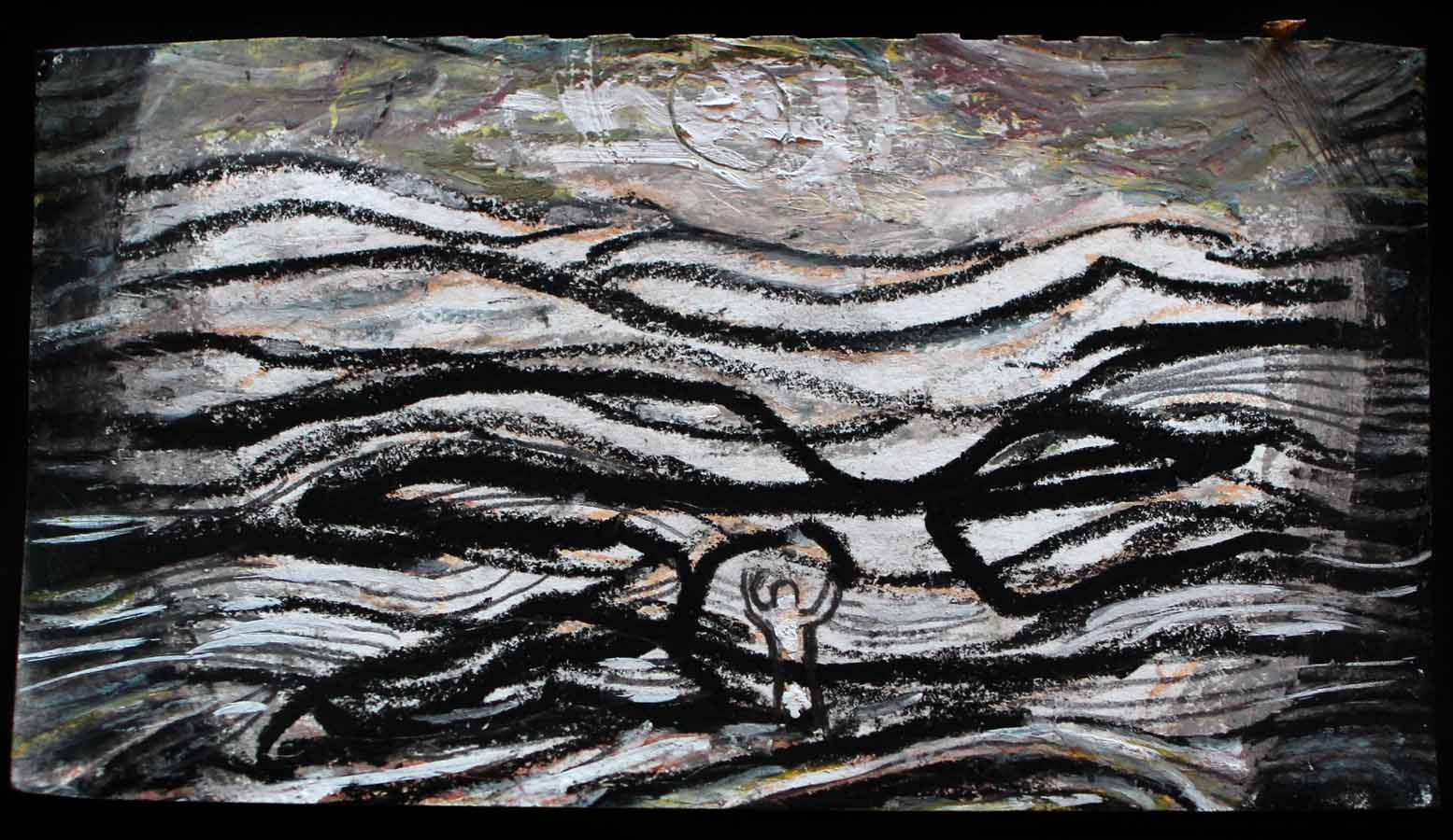
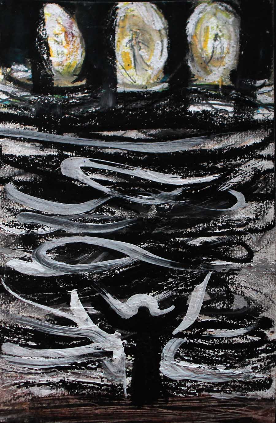
Painting by Avron Soyer
Black and white have their own world of drawing. They enter the realm of color from outside. White mixes with all colors. – Black is aloof, yet harmonious with brown and intimate with blue.
In Mardsen Hartley’s wonderful memorial celebrations of his dead Prussian officer lover, brilliant intense colors glow against pure black. Here black is a death that does not swallow or diminish life. White plays cold death in the sharp light of Charles Birchfield’s icy winter scenes.
Both black and white are purity and rest.
Black’s “home” is night. There is a resonance of moon and stars. -White’s “home” is snow and ice. There is a resonance of lilies and of clouds.
Colors are jewel like in a field of white. Colors glow as torches in a field of black.
Black and white transcend.
2. Focal Image and Background/World
2.1
A “background” is an area against which focal images appear.
Often students sensitively paint a figure then throw in an arbitrary color as background. Yet a background often occupies more than half the space.
Every area in a painting is important.
2.2
If you construct your focal image against one background you should if at all possible complete with that background…If you change all colors must be readjusted.
Background and focal colors should develop together
2.3
What is perceptually a background is existentially “the environment” and “world” in which the focal image “lives.”
A world limits that which can intelligibly appear within it. If the world is two-dimensional then a three-dimensional image cannot coherently appear. It would be experienced in endless fall.
A world supports its objects. In Munch’s “The Scream” the central figure was human but is now only and entirely what it is to scream. This metamorphosis requires the urban ghost world that surrounds it.
In a particularistic painting one can safely paint the background that one sees…Yet art is not limited to what we actually see. What are the environments of angels, vampires and Bodhisattvas?
Working with environment is not limited to choice of color and image. Brushwork is crucial. The focal image can emerge from a smooth or stormy surface. Paint rhythms can struggle or can“dance together.”
3. Composition
3.1
Composition is the relatedness of shape, line, brushwork, color, value, image and mood. Working as a unity is a principle of composition.
3.2
We have already used the word, Motion in one direction, however powerful, is always compositionally banal: a person standing on tip toe body vertical and stretching upward, a voice rising higher and higher, a plot in which a protagonist moves unchallenged from victory to victory. Tension is required.
I promised myself that my students would learn to place the figure where it expressively organizes the space it inhabits…The project is to make a painting not to “reproduce a figure”…Everything… should be developed together in an expressive coherent composition.
In art details are not engaged one by one. They are included in patterns. Composition emerges as an interplay of patterns.
One-sided subordination of part to whole is banal… The unity of multifigural compositions is “dialogical”: it accepts and works through interplay of differences.
3.3
A general principle of composition is that the glance be encouraged to move through the entire space…No area should be disregarded.
All included patterns should coordinate. It is an ideal, rarely attained, that each color would, were all other colors removed, constitute a coherent painting.
There can be great or minimal difference between object and background. Shapes can touch or be mutually isolated. They can melt into one another.
Compositions can be firmly integrated by a central mass reinforced by repetitive subordinate masses on either side.
Integration can be snatched almost miraculously from disequilibrium. A small area of bright intense color or an iconographically crucial figure on one side can balance a large mass on the other. A shape that suggests movement can carry vision into empty space.
Compositions can be flowing and gentle. They can be harsh and jagged. Composition is open to all moods and weathers of human existence.
3.4
Composition is crucial to all art. Yet there are differences between design in figurative and in directly medial work.
Figurative art must respect the given shape of things. Arms have bones and thus cannot bend in the middle to complete a pattern.
A figurative painting should be seen in one position (top to bottom). In directly medial art no one position is pregiven as dominant. It is an ideal of directly medial art that a painting should be complete when seen from all positions: every point and area should cohere in a multidirectional design.
3.5
Composition is “the soul of art”
*
The above is an Excerpt from Living Art- III. Art Words- Structural Distinctions by Avron Soyer, Click here to read the next section-
Living Art- V. Teaching Creativity -Painting Non-figurative “Objects” and Dancing with the Figure